If you’re a real estate agent, you probably don’t need us to tell you that the competition can be fierce. Standing out from the crowd could be the key to your next sale. However, creating custom content that can catch your potential client’s eye isn’t always easy.
Fortunately, you don’t have to start from scratch. Using unique real estate postcard templates allows you to send out personalized marketing materials and get more leads.
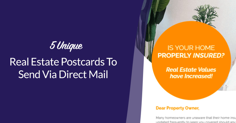
In this article, we’ll show you five clever real estate postcards that you can use for your next mailing project. We’ll also give you a few tips on how to use them to their full potential. Let’s go!
1. Simple and Professional
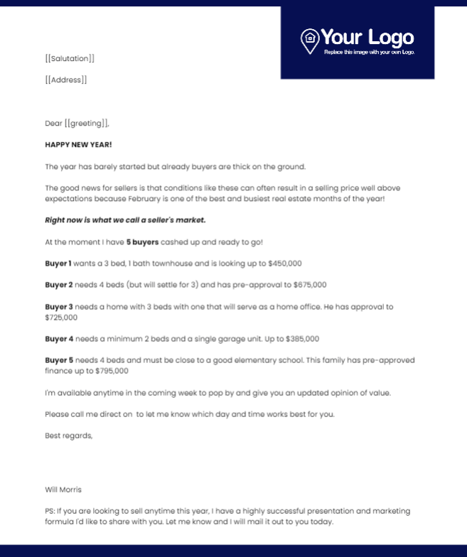
Not every postcard needs to be flashy. Sometimes, showing customers that you’re a professional agent is just as effective. This direct mail template can help you do just that.
Selling a home is typically a big decision. As such, a direct message such as this postcard can reassure potential clients that you will take their concerns seriously.
Most of this postcard is text. However, there’s also plenty of space between lines. Therefore, your customers will be able to skim it without missing key details.
This unique design has a few other benefits, such as:
- Being simple enough that you can personalize it to your business
- Drawing attention to your logo
- Providing specific information on potential buyers
To get the most out of this postcard, consider limiting the amount of information you include. That way, you can avoid making an intimidating wall of text.
2. Bright and Direct
Bright colors can quickly catch a person’s attention. Once they’ve noticed your postcard in their mailbox, they may be more likely to read the information included. This unique design can help make sure your marketing gets across to your target customers.
Additionally, this postcard also opens up with a direct question. Potential customers may be interested and want an answer. Because your information is readily available, they’re more likely to reach out to you with their queries and concerns.
There are also other elements of this design that can boost your marketing efforts, including:
- Room to include your photo for a more personalized message
- A clear description of what you have to offer potential clients
- Space for your logo at the top of the page
When customizing this postcard, consider adding multiple ways to get in touch. If clients can call, email, or even text you, they might find it easier to start the conversation.
3. Commanding and Bold
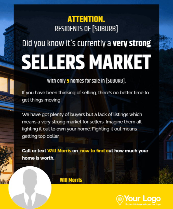
Most people get different kinds of mail every day. Furthermore, the majority of it is direct mail. A lot of this content tends to be simple, with neutral colors and minimal images. With a postcard like this, you can help your marketing stand out from these typical letters.
However, this postcard’s design is not just a way to catch someone’s attention. The color scheme is on the darker side, so it may seem more commanding and professional. This design can emphasize your confidence as a real estate agent.
You might also appreciate a few of the following features as well:
- Plenty of space to customize your neighborhood, houses for sale, and personal image
- The white main text, which makes the yellow highlighting stand out even more
- Call and text options to make scheduling an open house easy
For this unique postcard, you might want to supply a headshot that’s more professional than your typical image. Using this method, you’ll be matching the tone of the rest of the flyer.
4. Physical Yet Tech-Savvy
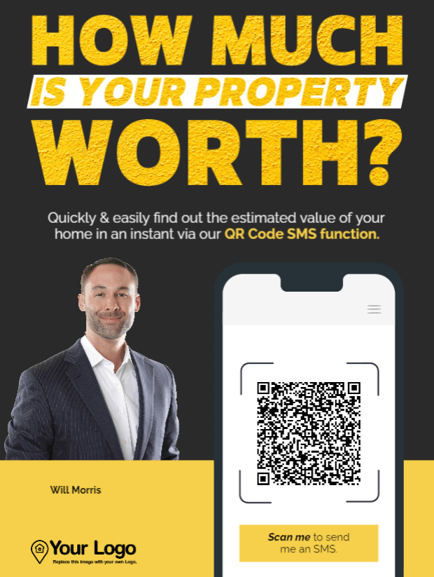
Using traditional direct mail is a very effective way to reach your clients. After all, it goes straight to the houses you’re trying to sell! However, a small step into the digital world can also be valuable.
This postcard is unique because it offers a QR code. Your recipients don’t have to memorize your information or even save the postcard – they can simply scan it and get a direct link instead.
Additionally, there are other benefits to this postcard, including:
- Textured lettering for a more distinct design
- A large space to include your Call to Action (CTA)
- A simple yet bold color scheme
In the default example, the QR code leads users to an SMS message. However, you can also use it to direct them to a relevant page on your site. Just make sure that the link is mobile and iPad friendly.
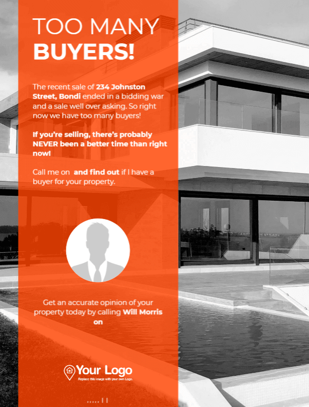
5. An interesting, clear headline
Using a CTA is an effective way to encourage potential customers to reach out to you. However, sometimes you don’t want to start your conversations with questions. This unique postcard design can help you hook recipients first with an exciting headline.
Those who receive this flyer may want to know more about what “too many buyers” means for them. Additionally, because the amount of text is relatively limited, they can trust that it won’t take long for them to find the answer.
Other benefits to this unique postcard include:
- A bold background for the text which is balanced by the rest of the muted colors
- Customization options down to individual local streets
- A sense of urgency based on the state of the market
You might want to consider describing the house that sold with this space as well. As long as you keep the description brief, you can encourage those with similar homes to picture themselves making sales.
Conclusion
Finding clients with homes to sell isn’t always easy. However, marketing materials that stand out from the crowd can go a long way. Fortunately, there are plenty of unique postcard templates that can help you get started.
In this article, we covered five different real estate templates that you can use to advertise your services:
- A professional, text-based flyer
- A postcard that relies on bright colors and direct language
- A dark, commanding design to communicate confidence
- Tech-savvy content that leverages QR codes
- A template with an attention-catching headline
If any of these postcards caught your eye, potential clients might feel the same! Learn more about how to create custom, effective marketing with a Jigglar free trial today!

