In today’s climate, you’re likely serving more mobile internet users than desktop users. Therefore, mobile-first design is integral to your real estate marketing strategy. But what exactly does that entail?
Essentially, it refers to strategies that make digital content more appealing to mobile users. For example, you can use responsive designs that adapt seamlessly to different screen sizes. But you also need to choose the right images and make your materials highly scannable.
In this post, we’ll discuss the shift towards mobile-first design in real estate. Then, we’ll share five tips to optimize your content. Let’s get started!
Why Is Mobile-First Design Important?
Mobile devices are becoming increasingly common for finding content online. Think about how many virtual tours and 3D property models are seen in today’s real estate listings.
Arguably, the reliance on digital platforms rapidly escalated during the COVID-19 pandemic, when home buyers and sellers weren’t able to view properties and meet with realtors in-person. However, this trend has become even more widespread since.
In fact, mobile internet traffic currently accounts for nearly 60 percent of total global traffic. Meanwhile, by the end of last year, nearly 70 percent of the global population used a smartphone.
Therefore, it’s more important than ever to make your materials engaging for mobile audiences. Otherwise, you might be providing a poor mobile experience, which can prompt leads to ditch your content and find answers elsewhere.
5 Tips to Optimize Content for Mobile Devices
Now that you know why mobile-first design is essential, let’s take a look at five ways to optimize your real estate content for mobile devices.
1. Choose Responsive Layouts
The first thing to do when creating content for a mobile audience is to prioritize responsive designs. This means that your layout will automatically adjust to different screen sizes including desktop, tablet, and mobile devices.
This would usually require knowledge of mobile best practices (e.g. aspect ratios). Or, you may even need experience writing code.
Therefore, it’s easier to implement responsive designs using templates. At Jigglar, you’ll find a wide selection of real estate templates for all your social media posts, digital flyers and brochures, ads, newsletters, and more:
These templates are mobile-ready, so they’ll look great on any device. Plus, you can make tons of customizations to make them unique.
For starters, you can insert your own colors, fonts, and logo to reflect your brand identity. On top of that, you can easily swap in your own property images, messaging, and contact details.
It’s super simple to add extra elements too like backgrounds, shapes, and graphical effects. And the editor is totally flexible, so you can add new pages, undo changes, and duplicate items.
2. Use the Right Images
Images are important for sprucing up content and making it more visually-appealing. However, not all images work well on mobile devices.
Typically, it’s best to opt for small file sizes, but you don’t want to sacrifice on quality or resolution. This is particularly relevant when highlighting intricate property details which might not show up in overly-compressed images.
So while compression can be useful, you don’t want to lose too much data. On top of that, make sure you use the correct image dimensions that align closely with the image container that the browser will render.
You also need to think about the file format for your real estate images. PNG can be too heavy, so we’d recommend using JPEG for mobile devices. But efficient next-gen formats like WebP work well too.
3. Make Content Scannable
Long bouts of text can be difficult to read on mobile devices since the screen size is much smaller.
Therefore, it’s a good idea to break up content into digestible chunks. This enables mobile users to quickly scan relevant content, without losing their location in dense paragraphs.
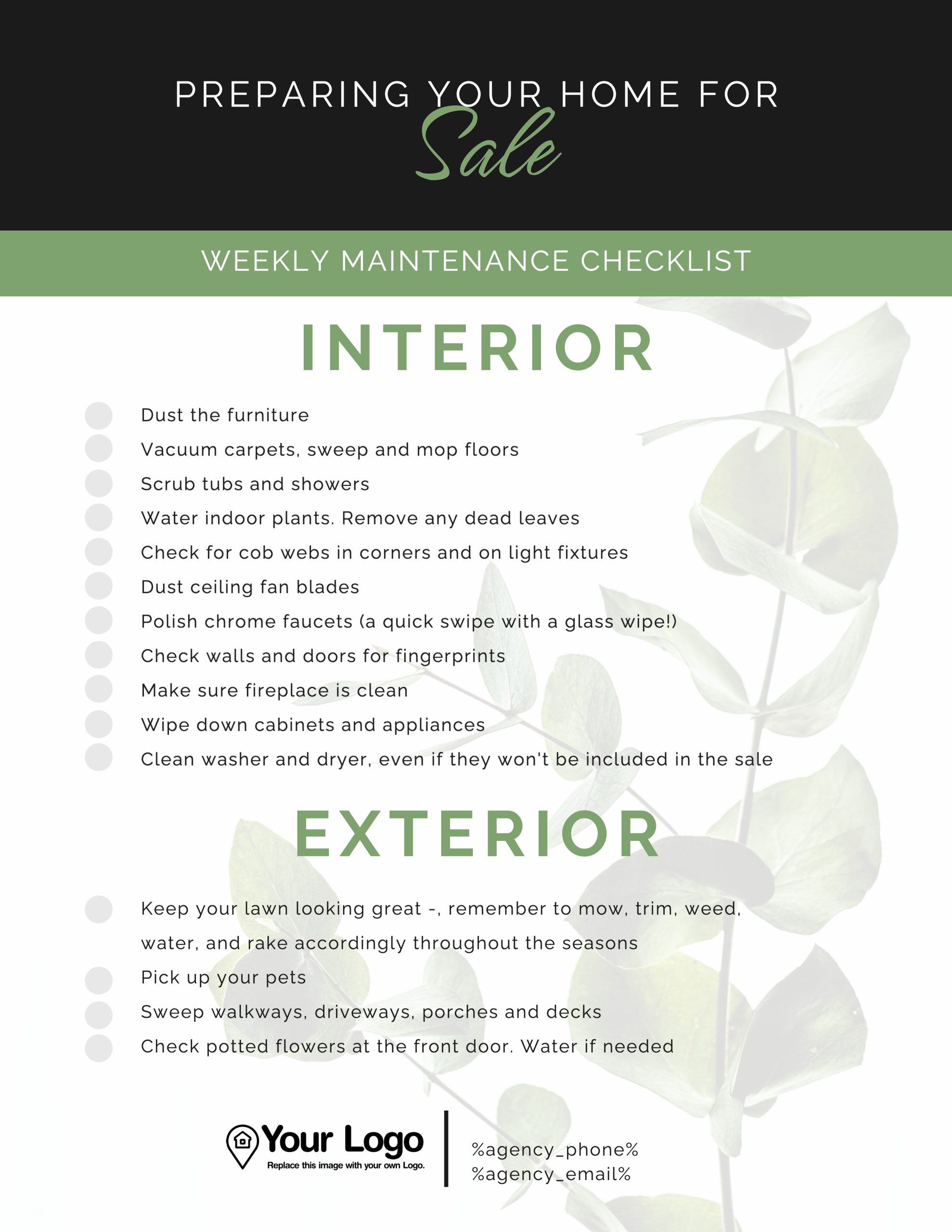
With this in mind, we’d encourage you to keep sentences and paragraphs concise:
It’s also good practice to intersperse text-based content with images and videos.
Alternatively, you can re-organize information into bulleted lists, or create shorter sections to place beneath subheadings. Whitespace is another technique to de-clutter your marketing materials.
4. Prioritize Your Call to Action (CTA)
Compared to desktop devices, you’ve got a far smaller window to present your offer to mobile users.
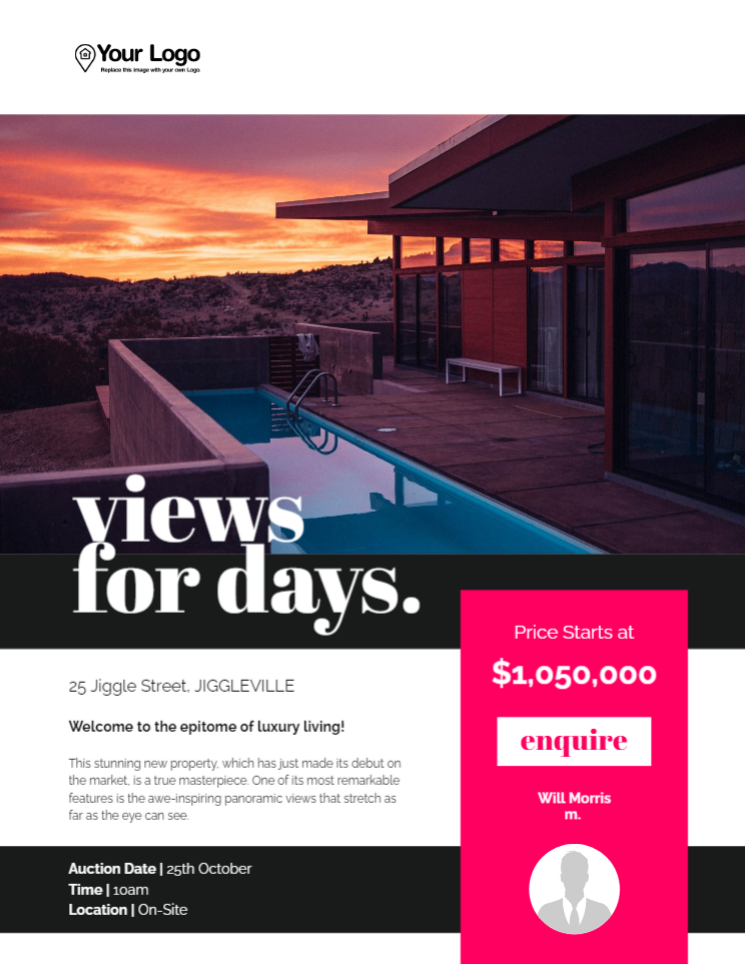
Therefore, you need to shift the most important information (like CTAs) into highly-visible locations. This makes it super accessible for a mobile audience:
It reduces the chance that visitors will become frustrated when they can’t find what they’re looking for, like contact details or links. And for you, displaying your CTA prominently means it won’t be missed, which can help you generate more leads.
5. Implement Interactive Elements
One way to quickly capture attention is to leverage interactive elements like links, buttons, and videos. Since most mobile devices use touch screens, it’s also really easy for users to engage with this type of content.
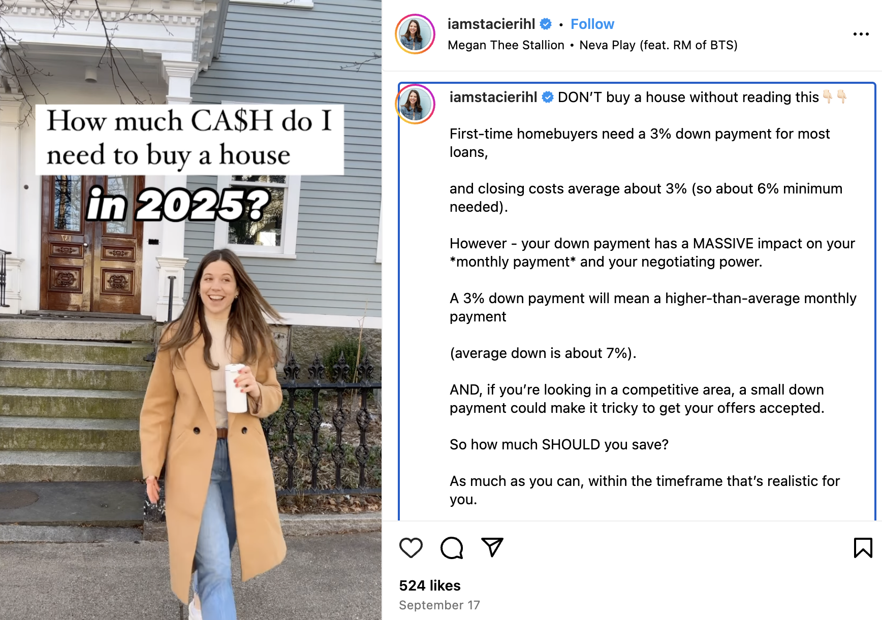
You could create an interactive infographic rather than writing a blog post. Or, you could film a variety of real estate videos where you might answer questions for first-time home buyers:
You could also incorporate maps, provide mortgage estimations, or include image sliders and carousels to encourage users to engage with your materials. Meanwhile, polls and surveys can be a great way to gain client feedback.
Conclusion
If you want to design high-converting materials, you need to meet your audience where they’re at. Recently, there’s been a huge increase in mobile internet traffic. Therefore, you can make your content more appealing by optimizing it for mobile devices.
To recap, here are five ways to design mobile-first real estate content:
- Choose responsive layouts.
- Use the right images.
- Make content scannable.
- Prioritize your call to action (CTA).
- Implement interactive elements.
Jigglar templates ensure that your real estate materials are always 100 percent adaptable to different screen sizes. All designs consist of the right image sizes, prominent CTA sections, and smart structures that make content digestible. Get started with a 14-day free trial!


