As a realtor, there are many tasks that demand your attention, but a big one is getting more listings. Naturally, it’s a good idea to build an online presence and run digital campaigns. But, you might also be looking for a way to set your services apart from other agencies.
If that’s the case, property flyers might be a viable option for your business, which can be a great addition to your overall marketing strategy. This way, you can form more meaningful relationships with clients, humanize your brand, and even expand your audience.
In this post, we’ll explore five ways to create effective property flyers to help you drum up business. Let’s get to it!
1. Test Design Options
If you want to create highly engaging marketing materials, design is your best friend. Not only will you need to think about optimizing the layout, but you’ll also want to include high-resolution images and incorporate key aspects of your real estate branding.
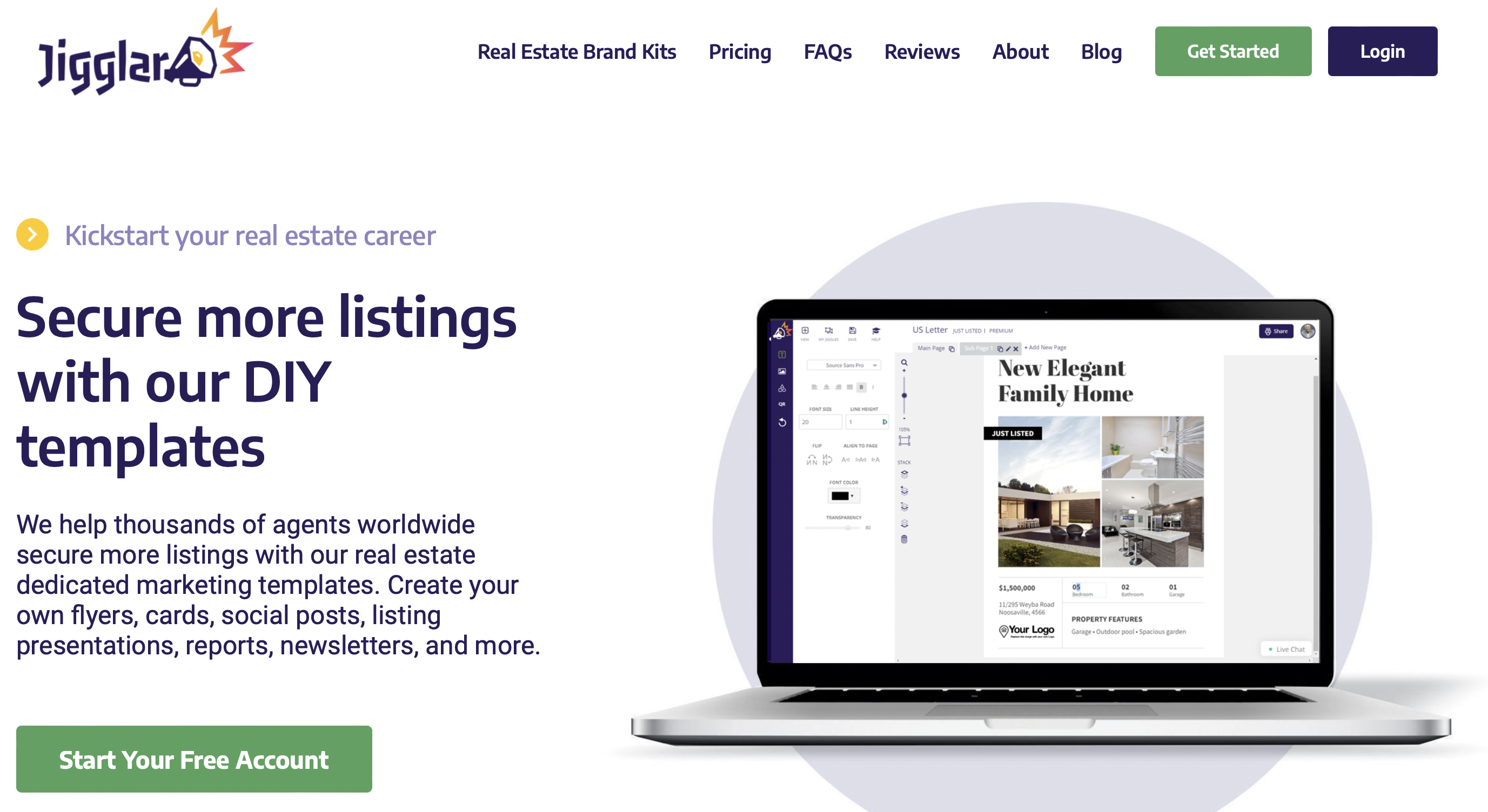
With that in mind, it’s best to experiment with different templates and designs until you find a look that works for you. If you lack creative skills, you can find a range of pre-made templates at Jigglar:
These are designed specifically for real estate agents, so you’ll find tons of options like postcard promotions, “just listed” flyers, “just sold” flyers, agent profiles, and more. Plus, there are templates for social media posts, newsletters, and infographics.
Additionally, the layouts are totally customizable, so it’s easy to move items around, add new elements, and include your brand details. Then, it’s a good idea to seek feedback from colleagues, friends, and even clients, and make any adjustments that might make your flyers more impactful.
2. Highlight the Price and Benefits
People tend to be very busy, and don’t have lots of time to spend reading your flyers. That’s why it’s best to make your materials easy to scan. Plus, the most important aspects should be instantly visible.
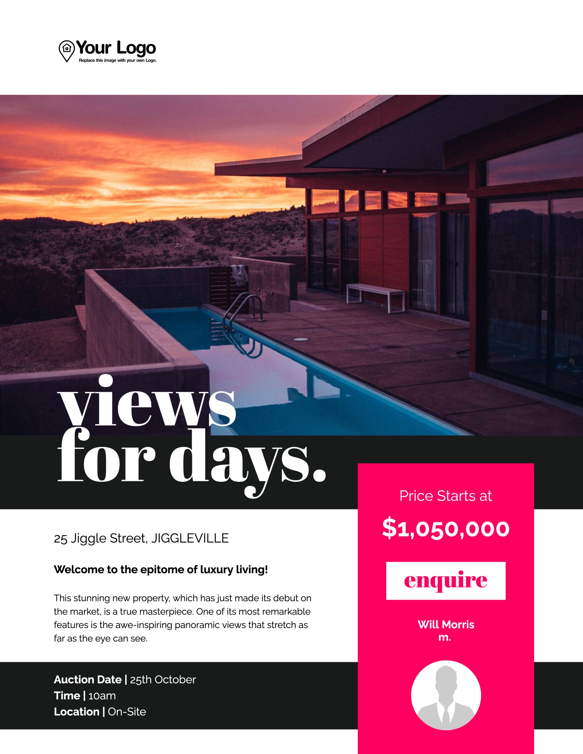
With that in mind, most prospects will want to know how much the property is listed for. Therefore, you can make this information clear by using a large font or creating a color contrast between the text and background.
It can also be a good idea to set the price within its own section, in a prime position on the page that makes it easy for people to see:
Besides pricing details, a lot of people are interested in the main features or benefits of the property. Does it offer remarkable views? How many bedrooms? Is there a garden or sufficient parking?
These are the questions that prospects want answering to decide whether to attend an open home event or enquire about the property. You can use the techniques above to make this information stand out. But, you might also include icons that represent bathrooms, bedrooms, and parking spaces to facilitate super quick skimming.
3. Include a QR Code
Although print materials are a great addition to your marketing strategy, the only problem is that people can’t carry out the desired action then and there. For example, they’ll have to pick up their mobile device to make a phone call or open an internet browser to view more information about the property online.
Luckily, you can solve this issue by including QR codes in your property flyers. This way, you can direct prospects to a landing page which features more details about the home such as the property’s history or floor plans.
If you use Jigglar to create and customize property flyers, you’ll also get access to a QR Code Generator which you can drop right onto your template to drive traffic to your website:
Alternatively, you might generate a QR code that dials your company’s phone number, sends an email, or sends a text message containing a link to the page.
This way, people can scan the code and complete the desired action much faster. Plus, it allows you to track referral sources more accurately, so that you can improve your marketing efforts.
4. Add a Clear Call to Action (CTA)
Although it may sound obvious, it’s important to let people know what you want them to do with your property flyer. Are you hosting an open house? Do you want them to scan a QR code? Would you like them to contact you directly?
Prospects shouldn’t have to question this next step, which is why you should make your call to action explicit:
Therefore, you can direct people’s attention towards your CTA by making it stand out on the page with the right colors, fonts, and images. But, it’s still a good idea to include your contact details, even if you aren’t calling out prospects to reach out.
5. Use Branding Elements
Finally, one of the most significant parts of any marketing strategy is presenting a cohesive visual brand. This can help you build brand recognition and eventually, establish authority within your niche.
Therefore, it’s a good idea to incorporate your brand colors within your property flyers. What’s more, with Jigglar templates, you can also upload your brand logo, name, contact details, and even your agent profile picture.
Conclusion
With a major shift towards digital platforms and online marketing strategies, it’s easy to overlook the power of traditional advertising. Property flyers are a great way to stand out from the competition and reach whole new audiences.
To recap, here are five ways to create more effective property flyers:
- Test design options.
- Highlight the price and benefits.
- Include a QR code.
- Add a clear call to action (CTA).
- Use branding elements.
At Jigglar, you get access to a wide selection of real estate marketing templates like flyers, postcards, social posts, newsletters, agent profiles, and more. Get started with a 14-day free trial today!


