Online design tools make it easy to create graphics and other materials. However, there are some common design mistakes in real estate marketing that you’ll need to avoid.
Messy and poorly designed content can diminish the impact of your marketing efforts. It will make you look unprofessional, resulting in fewer conversions. Bad design also makes it difficult for viewers to consume the information on your flyers, posters, and other content.
In this post, we’ll explore several prevalent design mistakes in real estate marketing and offer solutions for creating professional and compelling designs using Jigglar. Let’s dive right in!
Common Design Mistakes in Real Estate Marketing (Plus Solutions)
If you’re new to design, you might be worried about creating ineffective marketing materials. Here are some common mistakes to avoid when designing visual content.
1. Cluttered Layouts
It’s easy to get carried away when designing your content. You might try to fit in as much information as you can, and include multiple photos of the same property because you’re struggling to settle on just two or three.
However, overloading your flyers or brochures with text and images can dilute your message and deter potential clients. It also makes it difficult for the viewer to focus on key information, like the location and size of the property.
Solution
You’ll want to embrace minimalist design principles by focusing on essential elements. For example, you could utilize white space to create a clean and organized look.
Fortunately, Jigglar offers several minimalist templates for flyers, brochures, and other marketing materials:
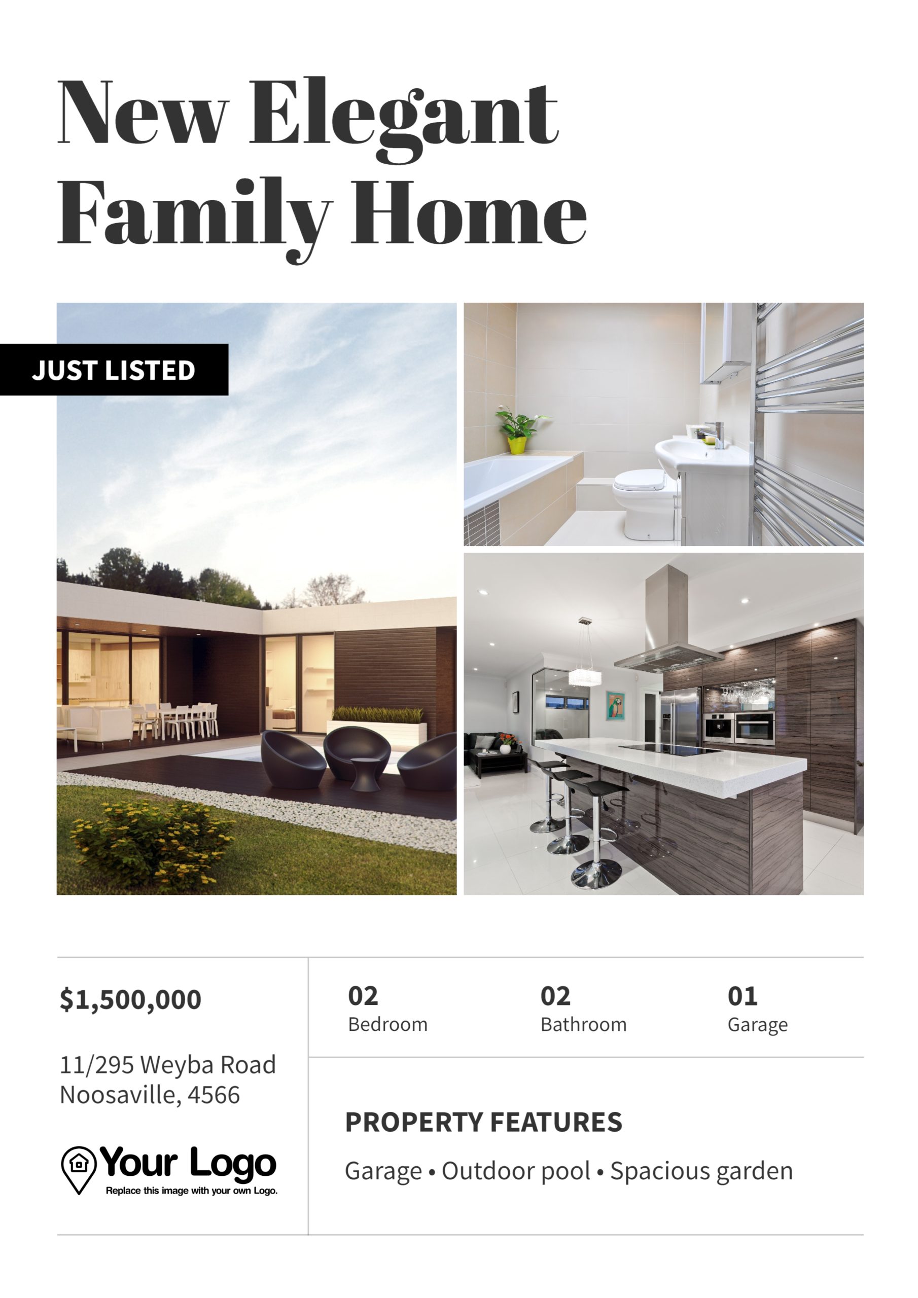
You won’t need to worry about minimizing text or images. Simply replace the existing placeholders with your own photos and information.
2. Poor Color Choices
Colors play a significant role in conveying emotions and establishing brand identity. However, using too many of them on the same piece of content can make you look unprofessional.
Additionally, you’ll want to avoid clashing colors, like bright red and green, or insufficient contrast, like using light pink text over a white background. Viewers will struggle to read your text if it’s not visible enough, or jars with other colors.
Solution
Stick to a cohesive color scheme that aligns with your brand. Ideally, you’ll want to use a maximum of three colors.
First, choose a neutral tone for text (like brown or dark grey). Then, select two accent colors (like orange or purple) for elements like headers and call-to-action buttons.
When you use Jigglar, you can easily apply your corporate colors to any template.
3. Low-Quality Images
Images are often the first element that catches the viewer’s eye. Poor-quality visuals can lead to negative perceptions of your brand, especially if the photo is pixelated, blurry, or badly cropped.
Solution
Jigglar’s templates are designed to showcase stunning visuals, allowing you to upload high-resolution images that highlight the best features of a property:
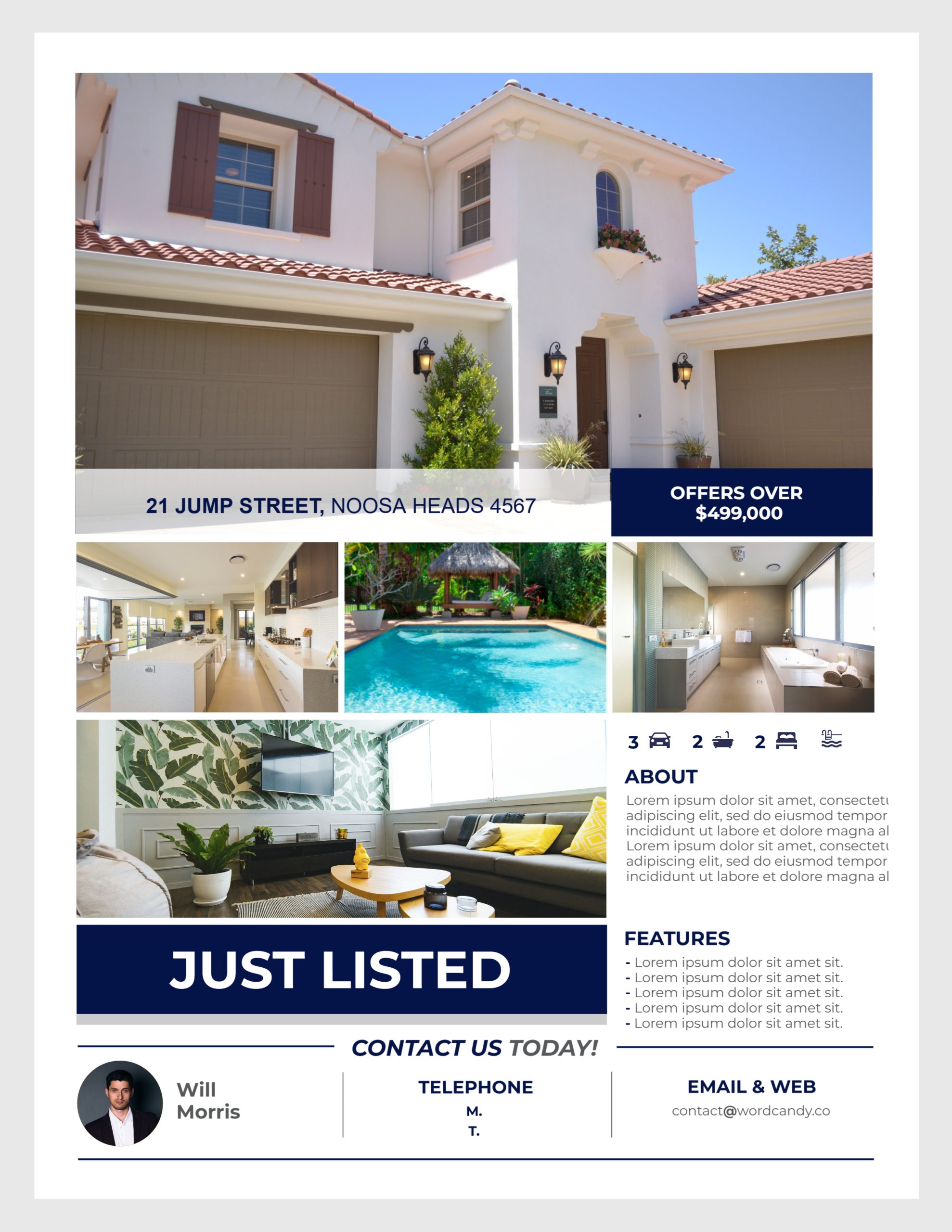
If you’re not confident with a camera, it might be a good idea to hire a photographer. Alternatively, you could do some research about creating professional property photos, and do some practice takes.
4. Inconsistent Branding
You might be tempted to use different colors and fonts in each of your marketing materials. However, inconsistency in design can confuse potential clients and weaken your brand identity.
Solution
Try to maintain a consistent brand identity by using the same fonts, colors, and logo placement in all your materials.
If you’re not sure what elements work best for you, do some A/B testing. For example, you might create two versions of the same flyer, but use a different color scheme in each one.
If the version with bold hues gets more engagement, you’ll want to stick with that color scheme for future marketing materials.
5. Overcomplicating Information
Perhaps you’ve just acquired an amazing property with a wealth of features. It’s understandable that you’d want to share all this information with home buyers, but providing too many details will likely overwhelm them.
Solution
Simplify your messaging by focusing on key selling points. Jigglar’s templates incorporate bullet points, short paragraphs, and clear headings to make information easily digestible:
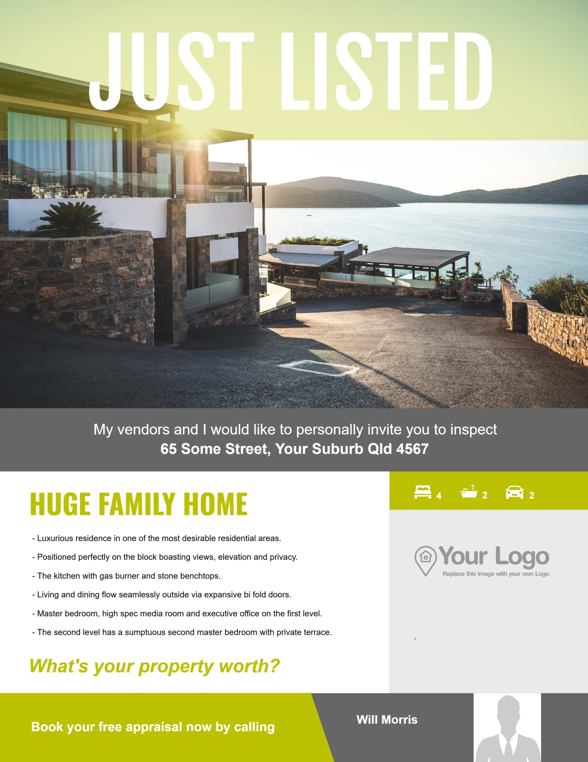
This is particularly important for property listings. Many viewers will just want the essentials: location, size, number of bedrooms and bathrooms, special amenities (like big gardens or swimming pools), and price.
6. Neglecting Mobile Optimization
With many clients accessing information via mobile devices, failing to optimize your marketing materials for smaller screens can result in a poor user experience.
For instance, you might use the wrong resolutions for social media posts, or the text in your flyers is too small for mobile devices.
Solution
With Jigglar, you can create responsive designs that look great on any device. Plus, you’ll find templates for different social media platforms and content types, with the right resolution.
These include Instagram Reels and Stories, Facebook posts and cover photos, and more:

This way, you can ensure that your marketing materials are accessible and effective across various screen sizes.
Conclusion
If you’re not a designer, it’s easy to make mistakes when creating your real estate marketing material. Fortunately, when you use pre-made templates like what you find on Jigglar, you won’t have to worry about any design pitfalls.
For instance, you’ll find minimalist templates to help you communicate key information effectively. However, you’ll also want to ensure that you use high-quality photos, complementary colors, and consistent branding.
Are you ready to design professional real estate materials? Get started with Jigglar today!