A flyer that stands out is a successful flyer. Most people are bombarded with marketing materials everywhere they go, from digital ads to commercials and, of course, flyers. If you want your real estate flyers to catch people’s attention, they need to be bold.
By bold, we don’t mean controversial or eclectic. There are many ways for a flyer to look amazing and get attention while remaining classy. If you have the right resources, you’ll be able to design professional-looking real estate flyers that no one can ignore.
In this article, we’ll go over four ways to make your real estate flyers stand out, from using QR codes to making offers that people just can’t refuse (to look away from). Let’s get to it!
1. Use a Heading That Stands Out
The first part of a flyer that most people pay attention to is the header or the main offer. If you design a flyer that’s just a wall of small text, no one will read it, even if it includes an offer for a free house for people that call you.
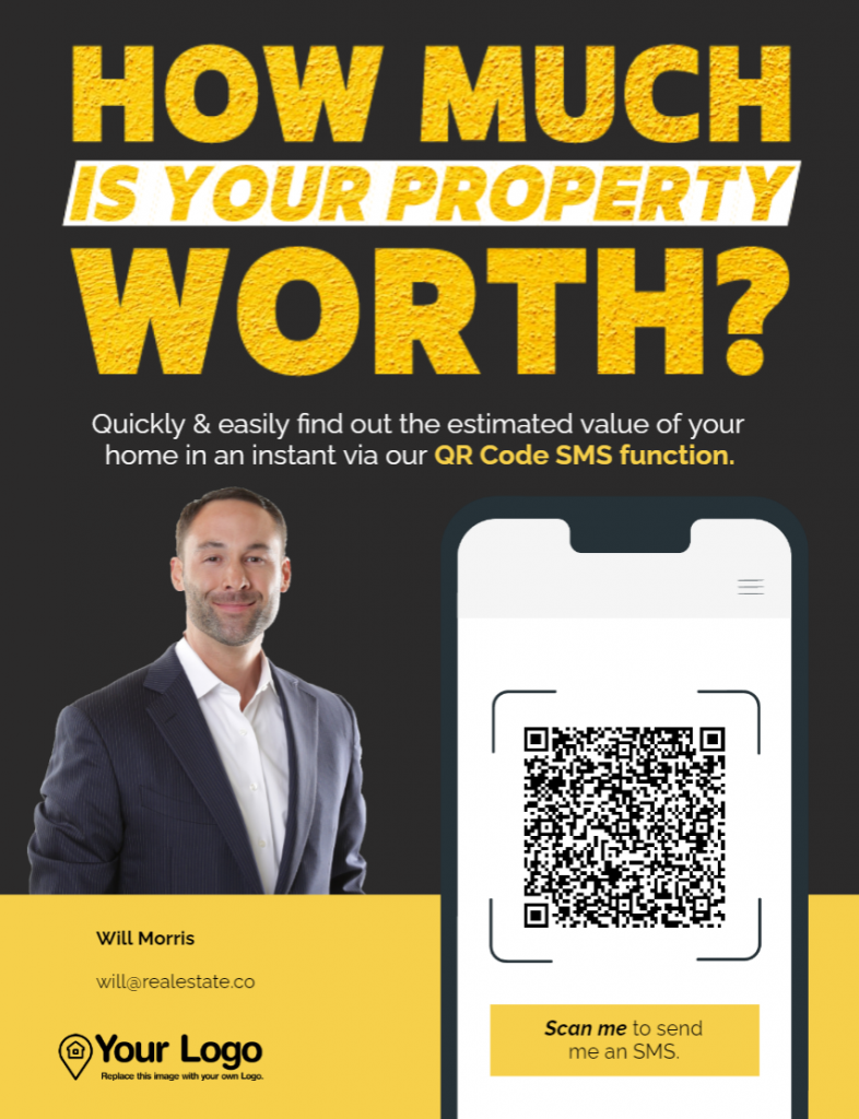
What you need to catch people’s eyes is the right offer in big, bold letters. It might sound simple, but it’s true. Anyone that sees your flyers should know exactly what you’re offering with only a quick glance:
Once you have people’s attention, that’s when you hit them with the rest of the details. For this to work, make sure the main header is bigger than the rest of the text and use colors that contrast with the background to make it easier to read.
2. Don’t Be Afraid to Use Bold Colors
One mistake a lot of flyer designers make is playing it too safe with the colors they use. A simple white background might save you money in printing, but it looks boring.
Instead of using bland colors, don’t be afraid to go bold. If you see a color that you think is eye-catching, try using it in your real estate flyers. Yellow, orange, purple, pink – all of these are great options that you can design gorgeous flyers around:
One great trick when it comes to deciding which colors to use in a flyer is to pay attention to contrast. Contrasting colors tend to stand out visually. It’s a trick you can use to make the text more readable and to make flyers more interesting.
If you’re not sure what colors contrast with one another, we recommend checking a color wheel. Colors on opposite sides of the wheel have high contrast and they should work well together.
3. Add QR Codes to Your Flyers
Sometimes, a flyer doesn’t give you enough room to include all the information you want to share. If you have a new listing, you can’t include all the details that potential buyers care about on a single page. At least, that is unless you want to include a mountain of text in the flyer.
QR codes offer a fantastic alternative to long walls of text. Instead of overwhelming readers with too much info on a single flyer, you can include a QR code that leads them to a website with more details or that shares your contact info with them:

If you’re not sure how to generate a QR code, we’ve got your back. Jigglar offers a QR code generator you can use with any of our real estate templates. The QR generator enables you to create codes that lead users to:
- Email addresses
- Phone numbers
- Specific URLs
If a user scans a QR code that leads to an email address or a phone number, the corresponding app will open enabling them to send a message or call. Nowadays, people can’t resist the temptation to scan QR codes, so you should use that to your advantage.
4. Use Real Estate Flyer Templates
All the design tips in the world might not make much of a difference if you simply don’t feel comfortable creating flyers from scratch. A great alternative is to hire a professional designer, but that’s expensive, and it can take a long time to go from idea to finished product.
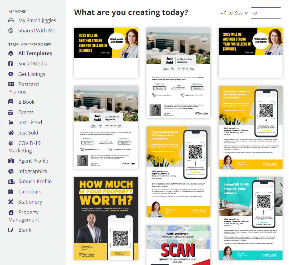
If you’re in that boat, you can benefit from using a service such as Jigglar. With Jigglar, you get access to hundreds of ready-to-go real estate templates you can use to create flyers, postcards, infographics, social media posts, and more:
You can customize any Jigglar template with an easy-to-use editor. The editor enables you to upload images, use icons, add text, generate QR codes, and much more.
Having templates you can use cuts out a lot of the initial design work for creating flyers. With this tool, you can take existing designs and customize them for your business to create flyers that people won’t be able to ignore.
Conclusion
Real estate flyers need to stand out to be successful. A flyer that blends into the background won’t attract any attention, and it’ll just be a waste of money. If you take the time to make your flyers pop, you’ll get a lot of return on that investment in the shape of leads.
If you’re not sure how to make your real estate flyers stand out, here are a few tips to keep in mind:
- Use a heading that stands out.
- Don’t be afraid to use bold colors.
- Add QR codes to your flyers.
- Use real estate flyer templates.
Are you ready to get to work on your next real estate flyer? Try out Jigglar for free and get access to our broad library of real estate flyer templates.


