A powerful just listed flyer is packed with compelling design elements that entice buyers to want to find out more.
Because numerous agents and agencies use flyers, the challenge is how to make your flyers stand out enough that buyers won’t be able to resist.
In essence, a well-thought-out flyer should be:
- Targeted – the just listed flyer needs to speak directly to your target buyers.
- Eye-catching – should make people want to stop and take an interest in reading it.
- Informative – has relevant information and details on how they can find out more.
- Convincing – should get people excited about the service, product, or event.
For just listed flyers, there are several design hacks that will help make your flyer appeal to your target audience. Below, we’re sharing some of them that will help you become a real estate top performer:
1. Good use of white space.

A good house for sale flyer contains plenty of white space. White space is the parts around the elements in your design. It is an essential building block of good design. The proper usage of white space can give your just listed flyer a little room to breathe.
White space helps you to reduce clutter, allow the main message to stand out, and create stronger and more irresistible design pieces.
2. Stunning image compositions.

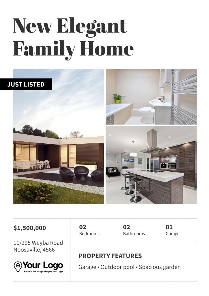
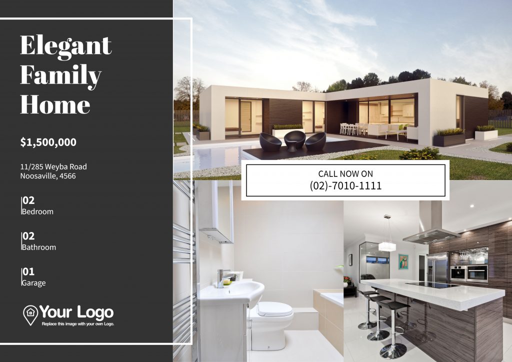
Arranging a large number of high-quality images can work well, especially when using grids.
Many of Jigglar’s just listed flyer templates include photo grid designs to showcase a property, event, or your agency’s services.
Ideally, the flyer should contain more than one image so buyers have more visual considerations, which are often powerful in helping agents close a sale.
3. Show; Don’t tell.

There are instances when a just listed flyer benefits more from images and less from texts. In such cases, focus on curating the best selection of photographs and make sure every word in the flyer serves a purpose.
4. Communicate with icons.
You’ll see this utilised in many modern flyers. If you’re opting for a minimal design, icons help to communicate information while saving space on words.
Consider the example below:

Details about the property such as the number of beds, bathrooms, and parking spaces are displayed as icons. Everyone can understand what they mean, and the flyer looks cleaner at the same time.
5. Excellent typography.

Beautiful typography is vital to good design. If you have yet to decide on a typeface for your brand, you can view Jigglar’s many options for font styles that will get your flyer noticed.
Typography, however, can be used to match the personality of either your brand or the property listing.
For instance, if the just listed property is elegant and upper-class, using cursive font styles with elongated characters and strokes may work well to convey the property’s beauty.
Key Takeaway
Just listed flyers share similarities with other real estate flyers, with the exception that they should inspire a feeling of excitement in buyers because a property has just been put up for sale.
Don’t worry if you’re not a designer. Starting with a flyer template such as the ones we offer here on Jigglar can let you create stunning just listed flyers easily.
If you have any of your own clever design hacks for just listed property flyers you’d like to share, drop them in the comment section below. Happy jiggling!


