The right fonts can aid brand perception, streamline visual designs, and ensure consistency across your materials. However, many realtors overlook the importance of typography in real estate and just focus on elements like images and CTAs.
The thing is, typography holds immense power in client communications. It massively alters the visual appearance of your resources. Plus, it enables you to convey your brand identity and influence emotions to drive action.
In this post, we’ll take a closer look at the role of font in your real estate materials. Then, we’ll share four tips to maximize typography in real estate marketing. Let’s jump in!
Does Font Choice Impact the Effectiveness of Your Materials?
Typography in real estate holds immense power when communicating with your audience.
Sure, it’s important that your text remains clear and legible. But with the right selections and contrasts, you can also amplify the visual appearance of your resources.
This is a great way to capture the attention of potential clients, which can be difficult when people get flooded with new content every day. However, it also defines your brand tone and personality.
For example, a serif font can be the perfect pick for brands looking to establish credibility. Meanwhile, quirky script fonts are ideal for creative businesses that want to convey their playful personalities.
Additionally, typography plays a pivotal role in visual marketing. It enables you to form emotional connections that spur action. For instance, a typeface that evokes feelings of warmth can help you build trust with new customers. Meanwhile, a bold typographic choice can convey strength and reliability.
How to Leverage Typography in Real Estate Marketing (4 Tips)
Now that you know more about the power of typography in real estate, let’s discuss four tips to leverage fonts within your marketing materials.
1. Ensure Text Is Readable
It goes without saying that legibility is crucial when choosing a typeface for your materials. This is especially relevant for long-form text.
Traditional typefaces like serif fonts tend to make good options. The clean lines enable viewers to focus on your messaging.
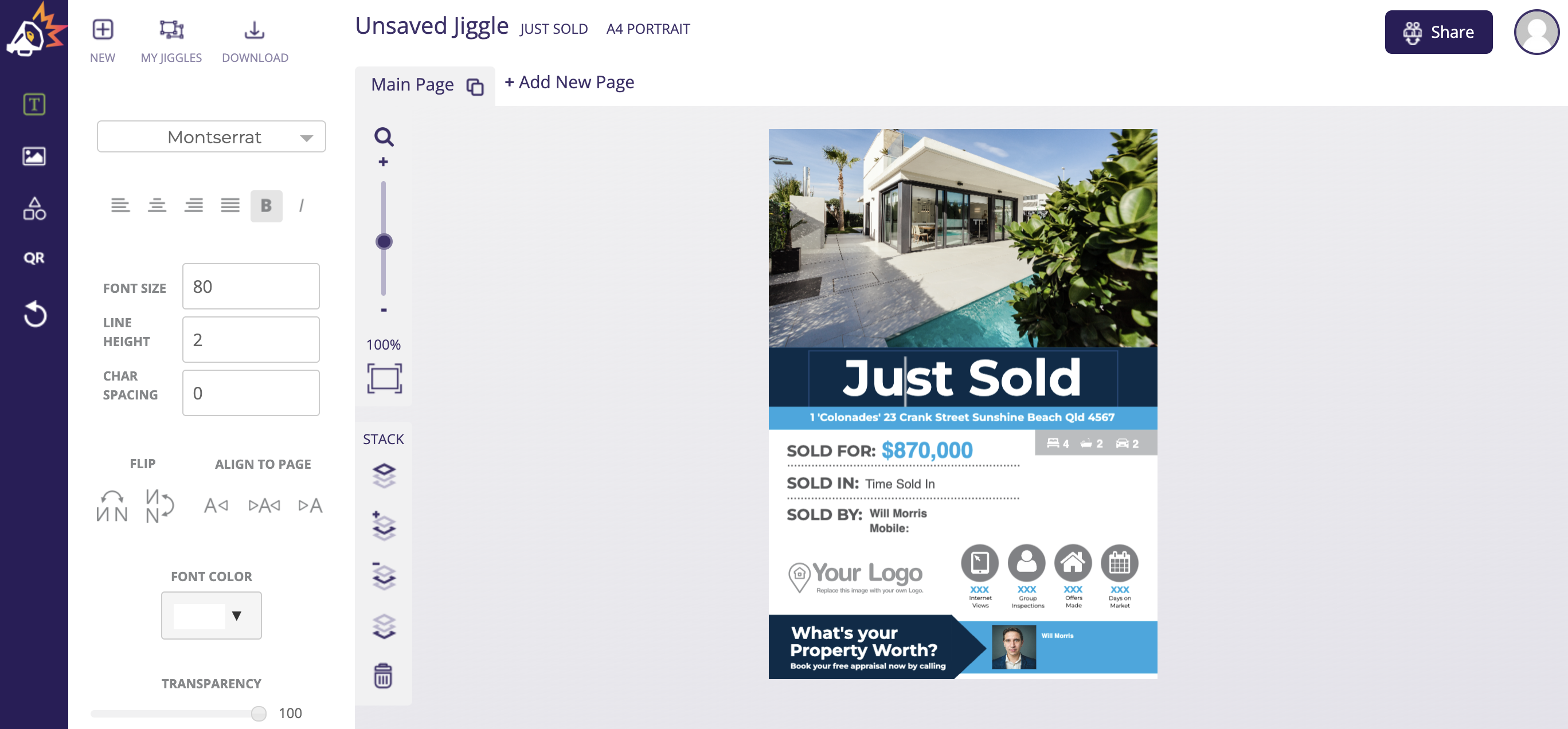
Jigglar templates make it easy to design your marketing materials, and you can access tons of typography options:
You’ll find everything from classic bold styles to dainty decorative fonts. Better yet, you’ll get full control over the font size, letter height, character spacing, color, position, and more.
It’s important to make sure that your font maintains readability, even in different sizes and mediums. While your preferred typeface might work as a heading, it could lose distinction in body text.
Finally, the spacing between letters is equally important for ensuring that your wording can be consumed easily. This is especially relevant when selecting fonts that might be viewed on smaller screens like mobile devices.
2. Match Typefaces Appropriately
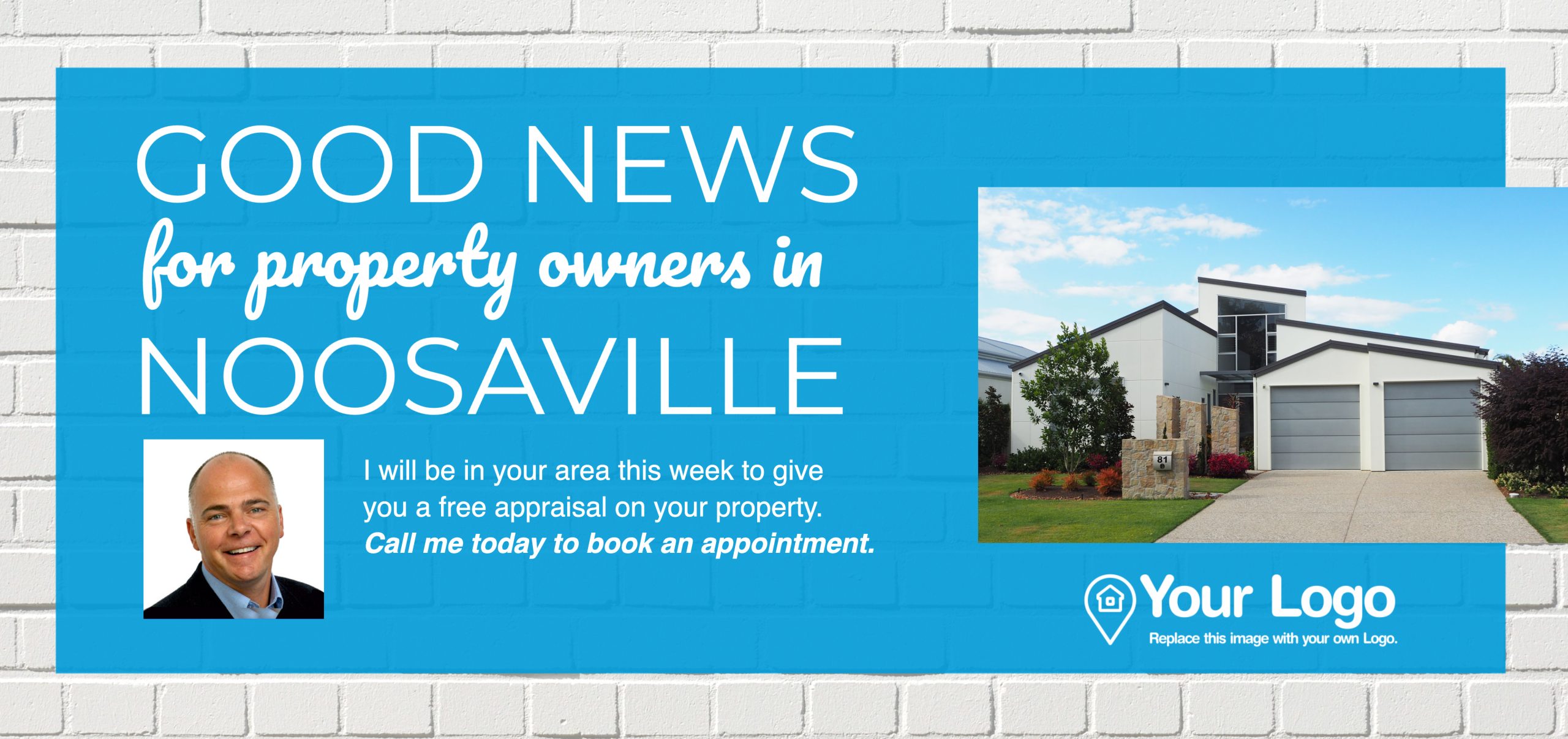
Most real estate companies combine multiple typographic styles to introduce texture and variety:
That said, it’s best to limit your font selection to just two variants per resource. Too many text forms can be distracting and interrupt the audiences’ visual experience.
There’s no rule that says you have to choose two fonts from the same family (e.g. serif, script, etc). In fact, contrasting styles can create a balancing effect, or be used to highlight key elements on the page:
However, it’s important to pair fonts wisely. Most real estate brands will stick with selections that offer some level of harmony. Perhaps they evoke a similar emotion or ascribe to the same style (weight, bolding, etc).
3. Use Decorative Font Sparingly
Some businesses leverage script and decorative fonts all the time. Typically though, these font types go along with a playful, whimsical brand identity.
As a real estate business, simplicity is key in visual design. It’s vital that prospects understand what you’ve written. Plus, you want to be taken seriously so that people will trust you to sell their homes:
That’s why we’d typically recommend serif and sans serif fonts for long-form text. But you don’t have to disregard script fonts entirely.
They’re actually really useful for featuring short-form text like quotes or social proof like testimonials:
This enables you to make important content stand out. It also makes your materials highly scannable, since busy customers can immediately find your glowing client review, which makes for super persuasive real estate copy.
4. Implement a Typographic Hierarchy
Typography in real estate should follow a hierarchy system that organizes and structures text, so that readers know what’s most important.
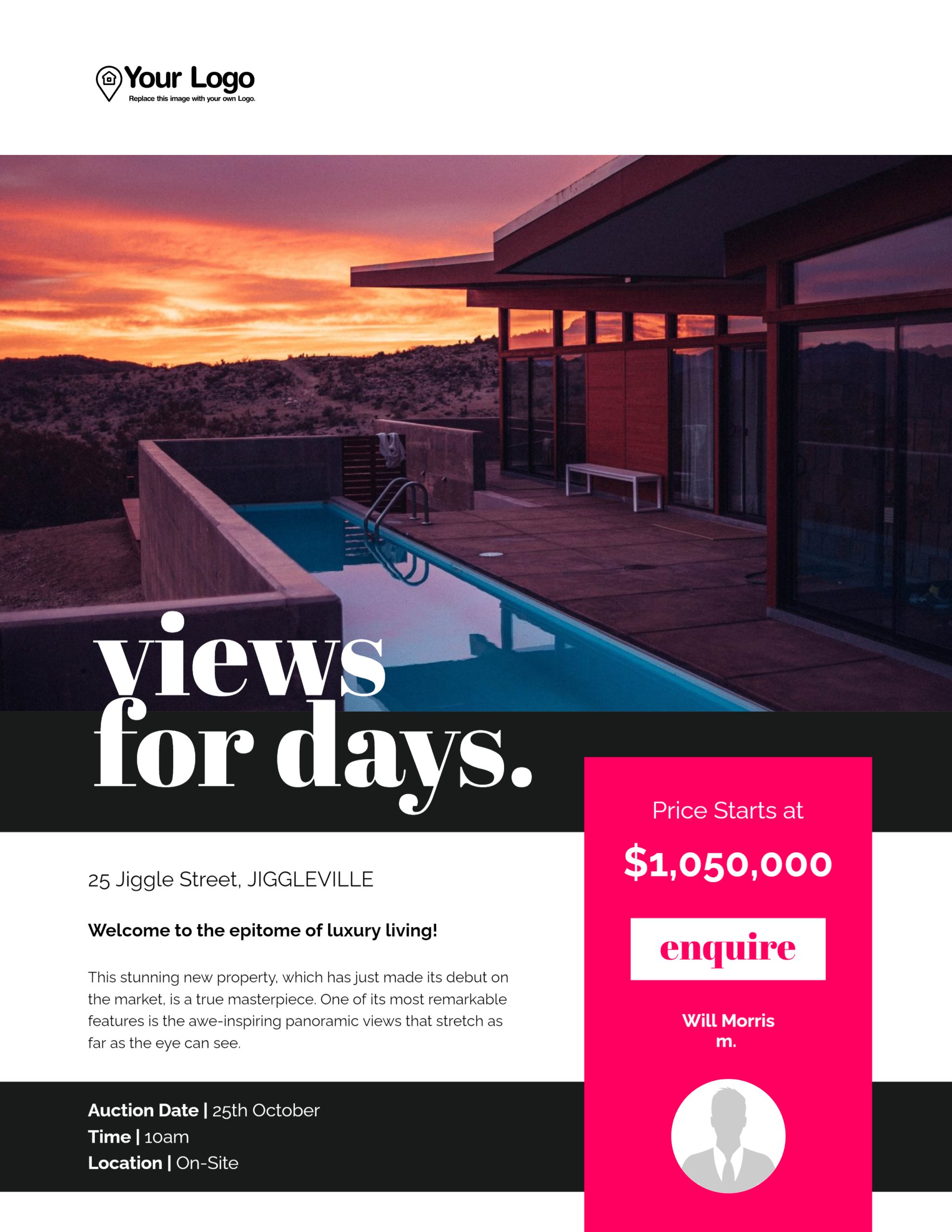
It implements a visual flow or pathway that guides the eyes to explore your materials in the optimum way:
Typically, a typographic hierarchy consists of the following elements:
- A headline at the top of the page. This should reflect your brand’s main font.
- A subheading. This might feature a second variant that complements the main font. It can be used to accent additional content (e.g. slogans, quotes).
- Paragraph copy contains the details you need customers to know. Usually, you’ll return to your main font but on a smaller scale.
Note that you can omit certain parts of the hierarchy if they’re not required. For example, a social media graphic may just feature a headline whereas a real estate Facebook ad might skip the paragraph text:
Regardless, you should always organize text in order of importance, ensuring a visible contrast in text size, weight, and sometimes, style between different elements.
Conclusion
Typography is one of the pillars of real estate marketing. Like images and color palettes, it enables you to enhance your visual marketing, draw on emotions, and reinforce your brand personality.
To recap, here are four ways to leverage the power of typography in real estate marketing:
- Ensure text is readable.
- Match typefaces appropriately.
- Use decorative font sparingly.
- Implement a typographic hierarchy.
With Jigglar templates, you’ll gain full control over typography options. You’ll find pre-made layouts for all your marketing materials. Plus, you can customize every aspect of your fonts, including the color, style, height, size, and position of text. Get started with a 14-day free trial!


