Your use of color in real estate marketing flyers plays a huge role in their reception. Using the right colors can help you get the reactions that you want, and it all comes down to psychology. Understanding which colors can elicit which emotions can help you drastically improve your marketing materials.
In this article, we’re going to talk about the basics of color psychology and go over several tips to apply it in real estate marketing. Let’s talk about flyers!
How Does Color Psychology Work?
It’s a well-researched fact that some colors can help elicit specific emotions. That’s not to say that if you see red you’re going to charge blindly at a flyer, but the color can help reinforce your message.
Color psychology not only focuses on how we react emotionally to colors, but how they affect our impressions of brands and consumer products. Some studies on color psychology show that color impacts the snap assessments that consumers make about a brand in around 62-90% of cases.
Your choice of color can also have a significant impact on brand recognition. As your brand grows in popularity, consumers will come to associate it with specific colors. If you use those colors repeatedly, it can help increase brand recognition by up to 80%.
3 Tips to Leverage Color Psychology in Real Estate Marketing Flyers
Color psychology should go hand in hand with copy and your flyers’ design. Jigglar can help you create stylish designs easily thanks to our extensive library of real estate marketing templates. Once you choose a template, you’re free to modify its colors.
1. Understand What Colors Consumers Associate with Which Personalities
Before you can apply color psychology in marketing, you need to have an understanding of which personalities consumers associate with which colors. There are dozens or hundreds of colors that we can discuss, but for now, let’s focus on five of the most common choices in marketing:
- Blue: Honest, wholesome, cheerful, down-to-earth
- Red: Daring, imaginative, spirited, bold
- Green: Intelligent, successful, reliable
- Purple: Charming, luxurious, glamorous
- Yellow: Outdoorsy, tough, masculine
Those adjectives can be enough to point you in the direction of which colors to use in which types of real estate flyers. For example, if you want to market a high-end property, the listing flyer could use purple to evoke that luxury feeling:
To make your work easier, we recommend keeping a color-emotion checklist at hand so you can refer to it at any time. When coming up with flyer ideas for new listings, consider how you want to market them based on their characteristics. Check what colors correspond to those traits and you’re off to a great start.
2. Consider What Colors to Associate With Your Brand
As a realtor, you make your own brand. Whether you work by yourself or as part of a real estate company, you want customers to have a clear idea of what type of business you engage in.
If you deal in luxury properties, your realtor flyers can use purple to highlight that fact. If you want to get buyers excited about working with you, a bright, saturated pink will make sure that they can’t ignore your flyers:
When it comes to color in real estate marketing, don’t be afraid to be bold. Using classic tones is a safe bet, but if you’re distributing flyers, you want them to stand out. That means opting for bright, saturated colors that make your materials stand out in the mailbox.
3. Choose Real Estate Flyer Templates that Fit Your Color Palette
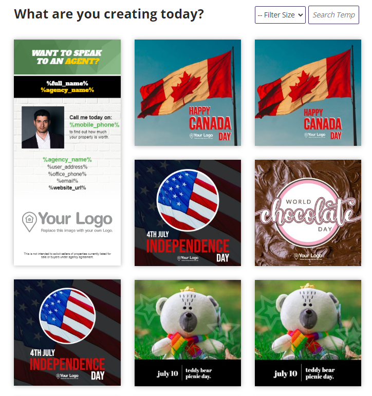
If you use Jigglar, you have access to a broad library of real estate templates, including designs in almost every color for almost every situation. That makes it easy for you to pick and choose templates depending on the colors they use and the psychological effect they may have:
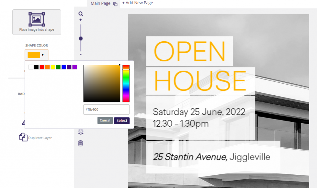
If you find a template that you love but that doesn’t use the colors that you want, you can always change them. The Jigglar editor enables you to change the colors of shapes and text with a simple color picker tool:
Once you’re happy with your template and color selection, you can save your flyer and send it to the printers. Every new design that you create gives you a new opportunity to experiment with new colors.
Conclusion
Understanding the basics of color psychology is simple. Some colors are more effective when it comes to helping you evoke specific emotions or ideas. Combine the right colors with great copy and designs and you have a formula for winning real estate flyers.
If you’re new to using color psychology in real estate marketing, here are three simple tips to keep in mind:
- Understand what colors customers associate with which personalities.
- Consider what colors to associate with your brand.
- Choose real estate flyer templates that fit your color palette.
Do you have any questions about using color psychology in real estate marketing flyers? Ask away in the comments section below!


